
Over the past year I’ve discovered a great joy in analyzing data, finding potential correlations, and recommending according process adjustments. I’m far from a data scientist but the field is fascinating to me, both in the practical use thereof and the ethical questions statistic-gathering and presentation can raise.
A project I’ve taken on recently has been to analyze a number of metrics when it comes to my work team’s customer support, and identify where, how, and why we can be more efficient (or in business speak, “profitable”). As an organization grows standardized processes allow for smooth expansion and consistent delivery, and the only way to judge the effectiveness of those processes—in my opinion—is through data-driven evidence.
When it comes to “unlimited” services, whether it’s for a salad bar, soda fountain, or corporate IT support, a great deal of thought needs to go into appropriate pricing and supply, based on the estimated average usage. Restaurants have calculated the average number of shrimp served with an endless platter, and base their purchasing, pricing, and service decisions on those averages. Of course there will be outliers, but on a long enough timeline, or large enough sample size, everything should regress to the mean.
For me then this kind of service data boils down to two questions: what are the averages, and how can they be improved?
An aside on performance metrics. Many of us have worked in jobs where we were judged on hitting specific performance numbers, be it the number of widgets produced or time spent resolving issues on the phone, and the one thing I see consistently is that numbers are used to punish people.
A great example comes from an unnamed company in which I was previously employed. One service technician was consistently topping the charts when it came to issues resolved, and his contributions to the team were well and truly valuable. When he saw however that his similar-paid coworkers were accomplishing almost half the issues he was, he decided to relax for a time and not stress so much about keeping his numbers up just for the sake of the numbers themselves.
Two weeks later he was called into management’s office and asked if he was feeling okay; his numbers had slipped and the company didn’t appreciate it. When he pointed out that he was still completing at least 25% more issues than other employees, he was told that the expectation had been set that he would do 100% more and he needed to return to that level of productivity or risk disciplinary action.
To me this is a prime example of “rewarding good work with more work,” which is a terrible and yet all-too-common management philosophy, often powered by statistics. From my perspective, in the age of an increasingly remote workforce, clear expectations should be communicated and results are what matters. If the expectation of a given position is that they will produce 100 widgets per day, it largely shouldn’t matter how long it takes the employee filling that position to produce those widgets, so long as they are hitting all appropriate deadlines.
If the expectations turn out to be unrealistic, either in the positive or negative, that should lead to an investigation of where the problem is and steps taken to rectify the situation; is the average staff member able to meet production expectations, and how does management address expectations that are either too high or too low? It is my personal belief that metrics should never be used to punish staff for “only” meeting expectations.
If the stated expectations are the problem, that’s what needs to be addressed, and they should be addressed fairly across the board.
In the field of information technology service and support, there are many metrics used to identify an operation’s health relative to the competition. Having a reasonable number of employees compared to end-user devices covered is a good start, as well as identifying the value of those service contracts. The former drives engineering processes and how support can be streamlined, while the latter drives sales processes and helping clients understand the value of the service.
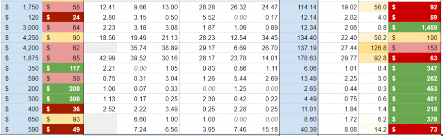
Without going into specifics about the nature of my current investigations, it’s interesting to me to see what different clients pay for roughly the same services. If one client has 300 users and another only 50, it’s logical that there will be an objective price difference, but how does the price-per-user hold up? How much more labor-per-user is one company using over the other? Extending these questions out to an entire customer base, identifying engineering efficiencies as well as the normalized value of contracts are key methods to designing, implementing, and establishing a sustainable service model.
Statistics are a powerful tool, but what also matters is the presentation. There’s a fantastic website (and now book) called Spurious Correlations, which combs through large amounts of data to find charts and graphs that look related, but likely have nothing to do with one another. Take this image for example; it would not be difficult to present the idea that these two data sets have some manner of causal link:
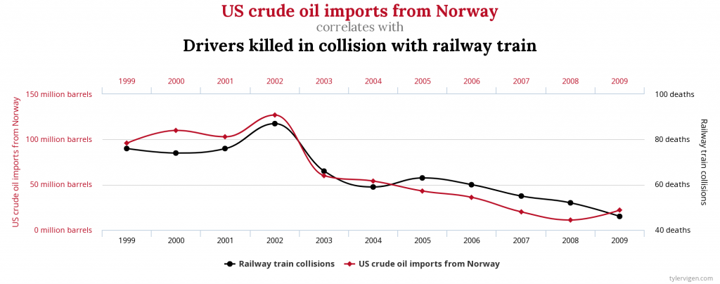
Does the amount of crude oil imported from Norway in any way relate to the number of drivers killed by railway trains? It would be a very long stretch of the imagination to say they do, but when presented like this, the argument—or at least suggestion—could certainly be made.
There’s the old adage “figures never lie, but liars always figure.” When I’m discussing metrics, both those internal to our company and those that get thrown around in the media, I very often feel it necessary to remind myself and others that the data isn’t the whole story; it only presents what it presents and any inferences thereof are mine and mine alone.
If I look at a particular IT client in isolation and see that, on average, they pay $20 per month per employee for IT support, I may be disheartened because that number may be so far below the average. Only looking at that metric, it may be easy to say that they are a problem client and their continued service is functionally costing us money. However, if I add in that we do an average of 3 minutes of labor per client employee per month, all of a sudden that contract looks remarkably profitable, as their effective billing rate is nearly $400 per labor hour.
Does that make this contract valuable for the company? That isn’t something the data can give you. The data don’t care about what your management philosophies or quarterly goals are—the data are the data. It’s up to a company to determine what it finds valuable and what metrics are important to measure, and how that will inform their next steps.
Ideally the role I’d love to have is helping manage those processes and values, using data to help drive policy and procedure to maximize effectiveness. My higher-ups are starting to see the value in the metric-specific work I’ve been doing between other projects, and I look forward to the day where this becomes my primary job role instead of an adjunct analysis that I do whenever it fits into my schedule.


